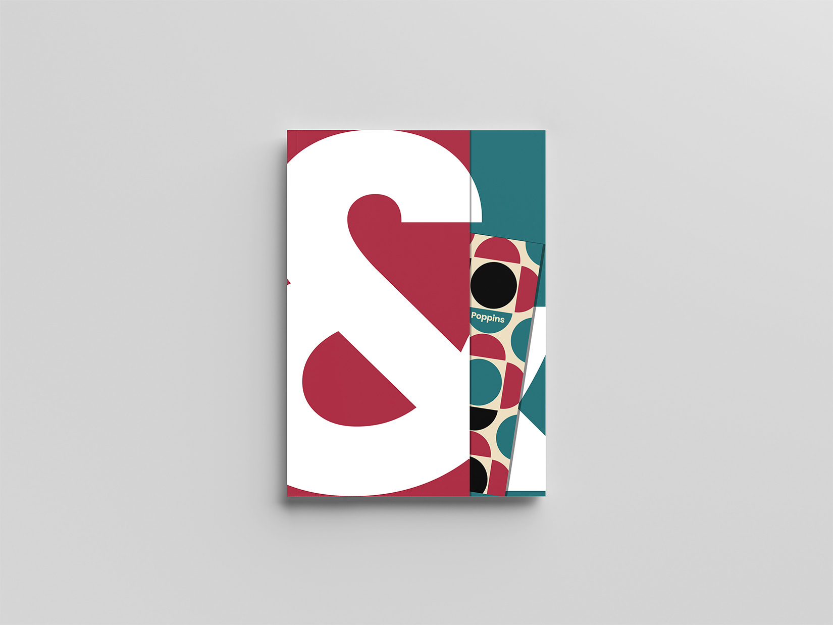
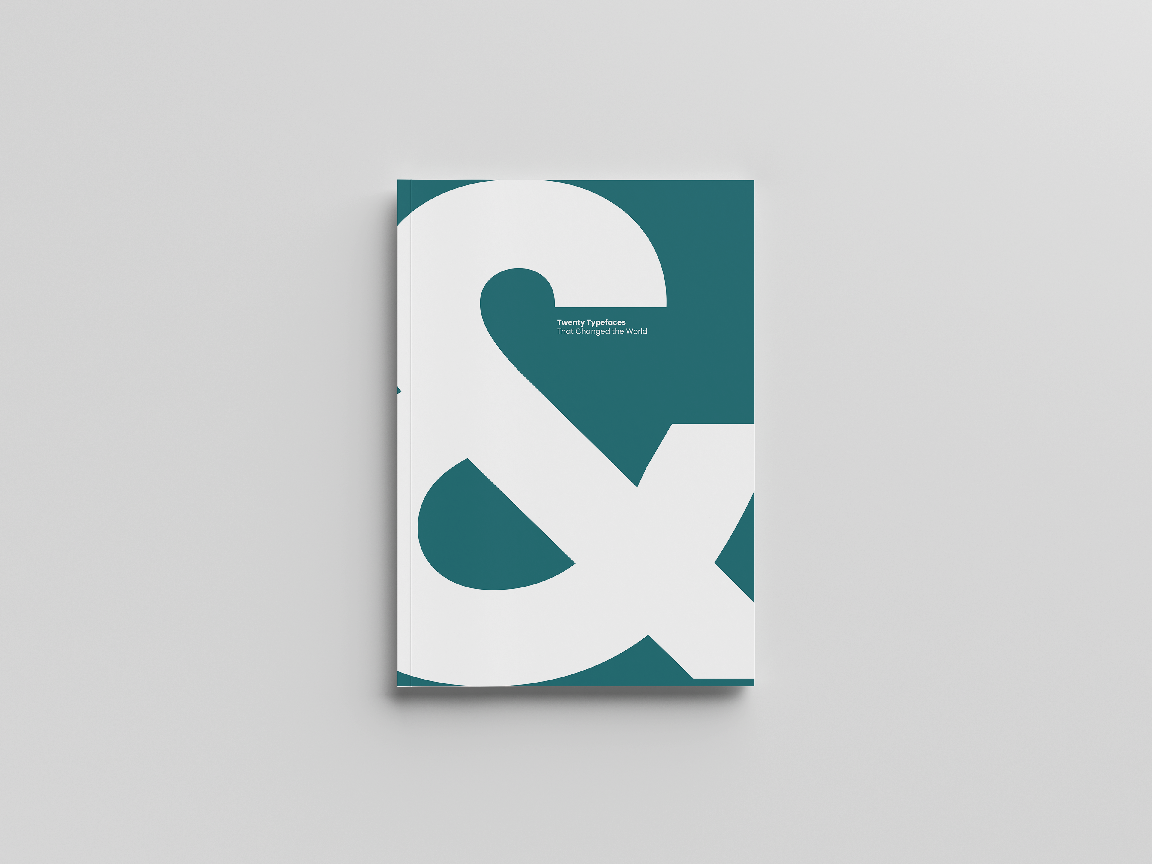
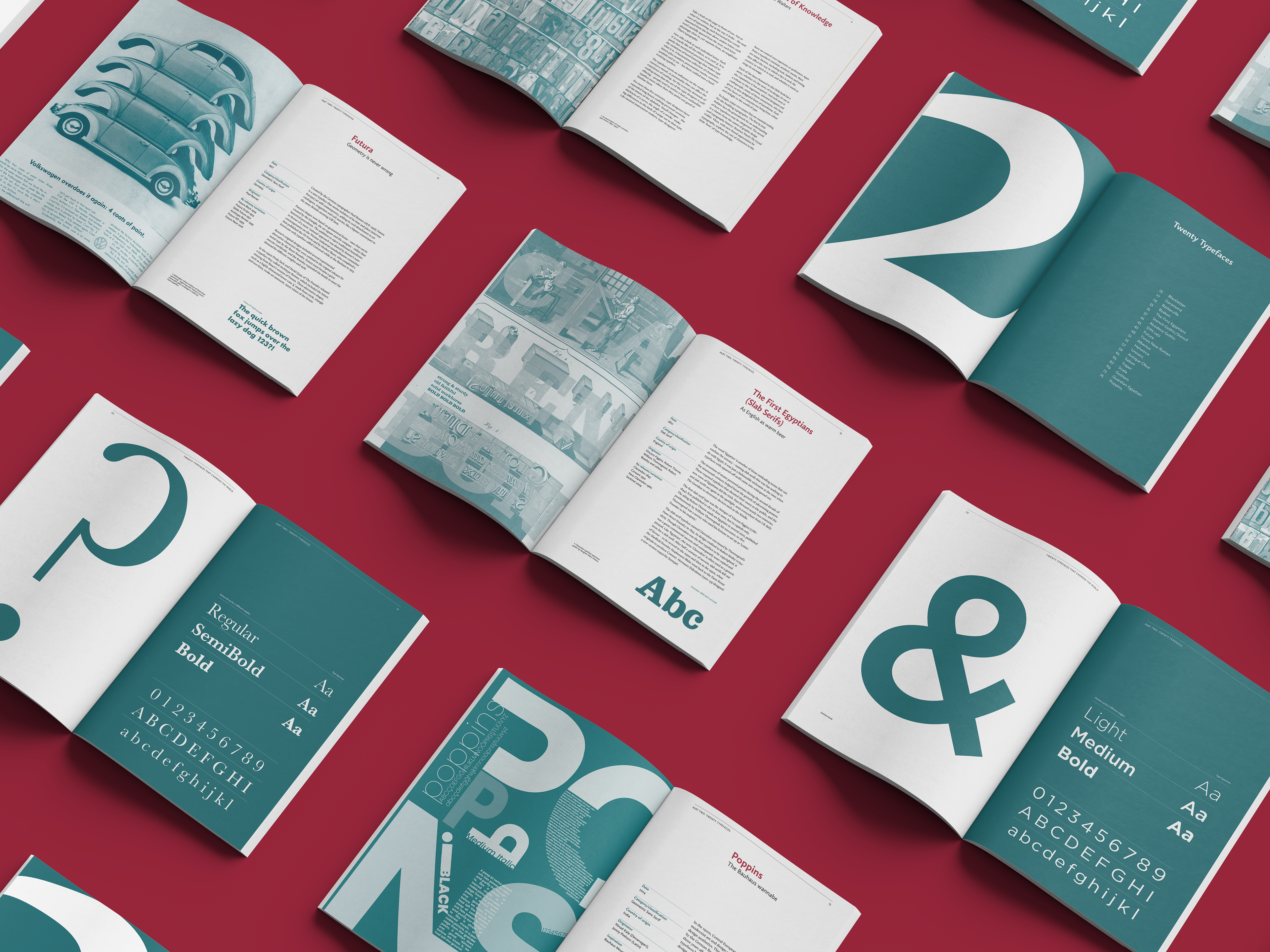
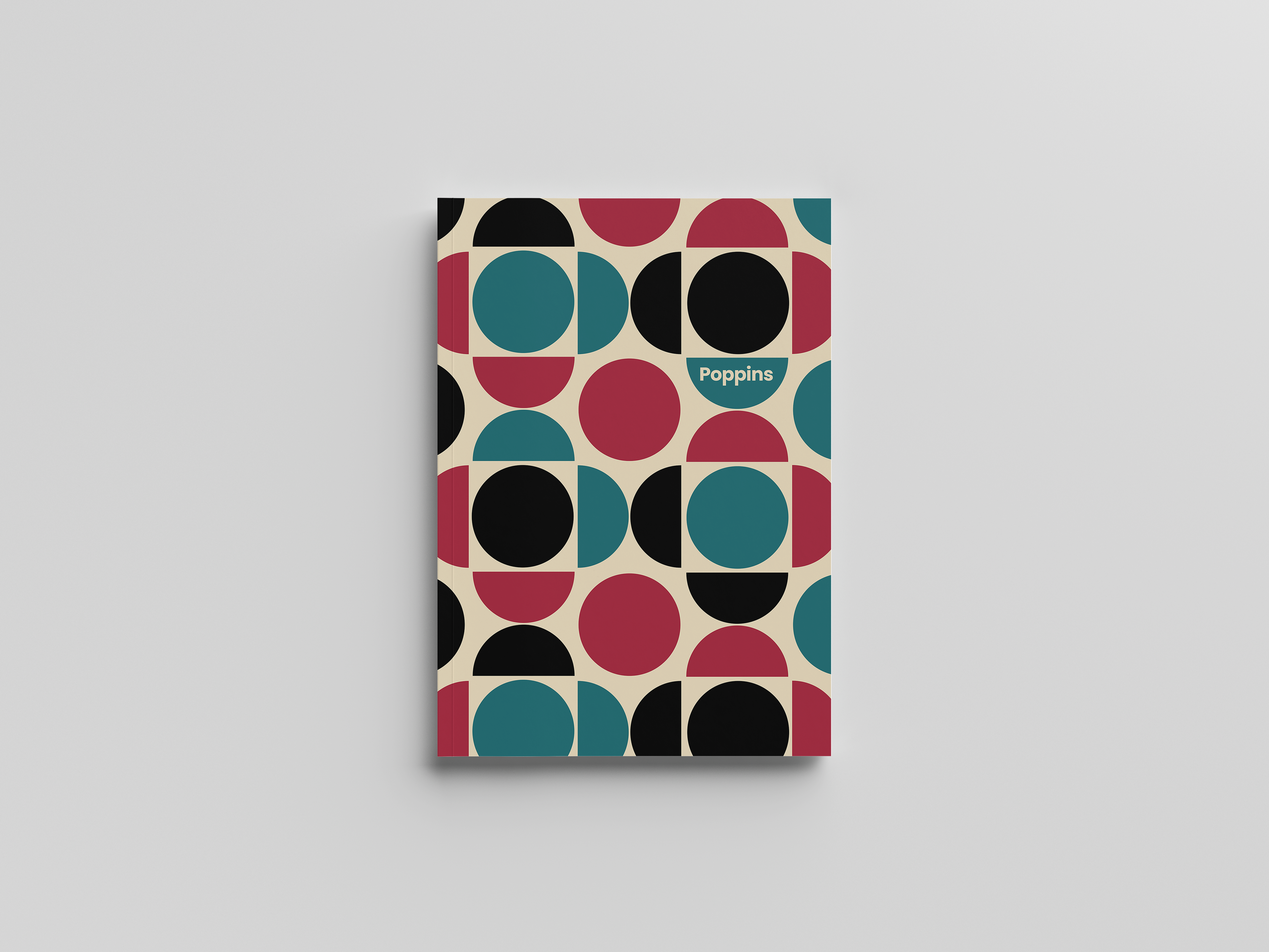
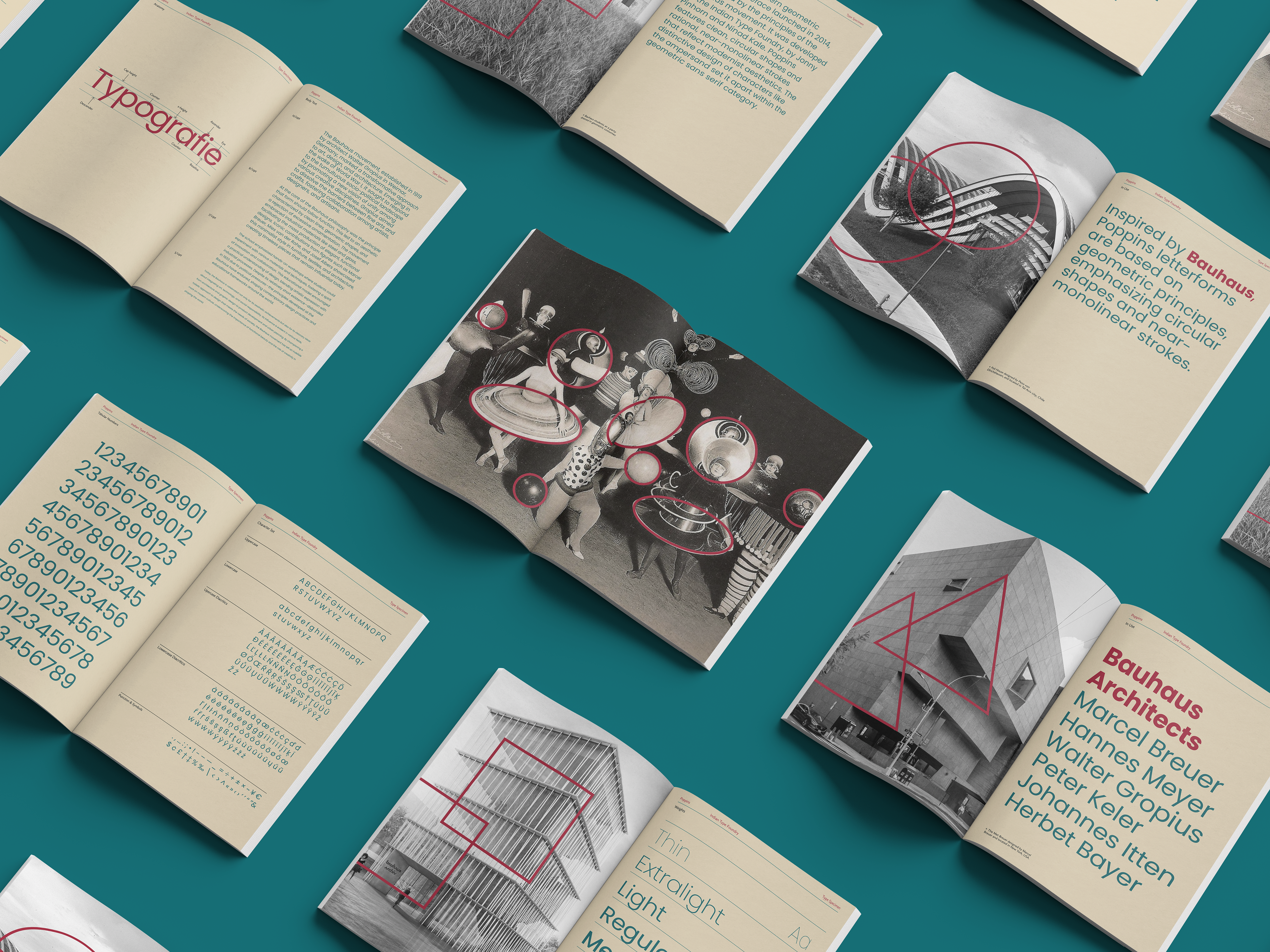
This project involved curating and organising 20 influential typefaces, as well as creating a contemporary specimen for the twentieth which was a font of my choosing; poppins. For my Twenty Typefaces That Changed the World book, I aimed to create an elegant and cohesive design using deep colour tones and a strong visual structure.
Inspired by Bauhaus design, Poppins features geometric letterforms, which I echoed through imagery of Bauhaus architecture using circles, triangles, and squares. This project balanced expressive visual elements with structured typographic hierarchy, demonstrating how grid systems and considered design choices can bring clarity, depth, and personality to editorial design.
designed by tia Betteridge